
IMAGE IS EVERYTHING
Your logo is an integral part of your brand identity. It should be clear, concise, and uniquely YOU. Your logo should be as singular as your business, visually compelling, recognizable, informative, and translate well across a variety of media.
HOW DOES THIS WORK?
Branding doesn't need to break the bank. There are a variety of options available, with packages designed to suit nearly any budget. Finished logo files are provided in industry standard formats for print and web-based media (including PSD, PDF, TIF, AI, JPEG, PNG, etc.)

CASE STUDIES
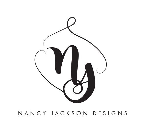
NANCY JACKSON DESIGNS
The Client is an accomplished silversmith and jewelry designer known for her intricately detailed pieces, each painstakingly created by hand using the highest quality metals, jewels, beading, and other materials and utilizing time-honored techniques. Every finished piece is carefully packaged in equally delicate and intricate packaging that reflects the work. Printed cards are included with each purchase to increase brand recognition. The initials within the Nancy Jackson Designs logo are a simple yet elegant black script, surrounded by two gently scrolling lines, representative of the delicate nature of the Client's work. The logo serves as a visually compelling complement to the Client's work and lends well to both web and print media.

OUR GLASS
Our Glass, as a successful restaurant, bar, and art gallery, was rebranding itself in a transition to an event venue. The Client's vision was of a wine glass integrated with the text of the title, in a loose and 'painterly' style that reflected the secondary purpose of the venue - as an art gallery. The font was created from scratch to closely match a similar look favored by the client. Named "Swish" the design features brush strokes in vibrant shades of red and purple, representing the liquid in the wine glass and creating a "pop" against the text. The resulting brand manages to be crisp yet free-flowing, and easily translated across media.
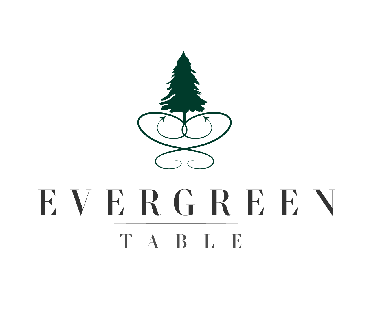
EVERGREEN TABLE
EVERGREEN TABLE is a farm to table market and eatery featuring locally sourced ingredients in an upscale, modern venue with an urban farmhouse vibe. The dark green of the evergreen icon is a reflection of the earth-based nature of the company, balanced against the simplicity of the lettering.
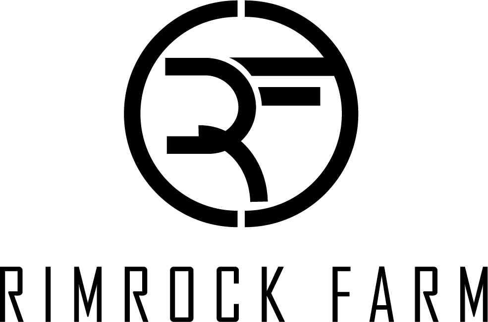
RIMROCK FARM
The Client requested a simplistic. streamlined logo focused on the name of the company, and/or the initials, with little additional ornamentation. The logo should be black and white, with clean lines ideal for easy identification and application across a variety of media, including packaging materials, as the brand was developed for a craft farm that would be utilizing the logo on a multitude of surfaces.
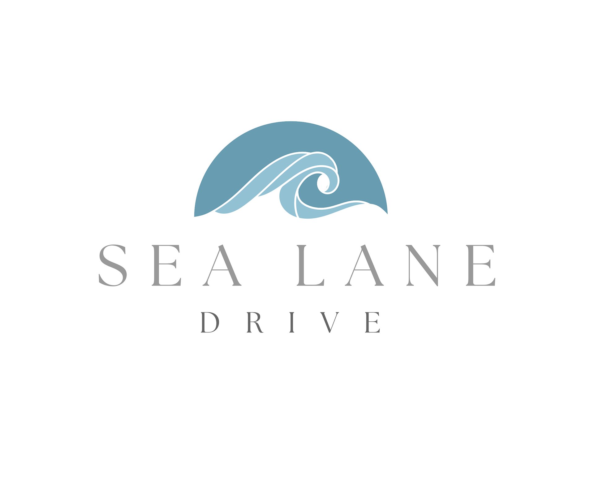
SEA LANE DRIVE
Creation of a custom logo for a Malibu real estate listing for the Client. Logos needed to reflect the eclectic and artistic aesthetic of the property, and incorporate teal/blue and silver, to capture the elegance of the home as well as its proximity to the ocean. The 'icon' for the logo was inspired by a stacked stone sculpture featured on the grounds and favored by the sellers, and the simple fonts that accompany the artwork work as a balance.

MARCH FORTH
Designed for a non-profit organization, the 'icon' of the logo features a stylized 'burst' or mandala meant to mimic the spokes of a wheel, ever reaching outward, each one integral to the process of the whole, representing the various arms of the organization working together towards a common goal. The use of pink and purple as the focal colors were selected by the Client as a tribute to the inspiration behind the organization.
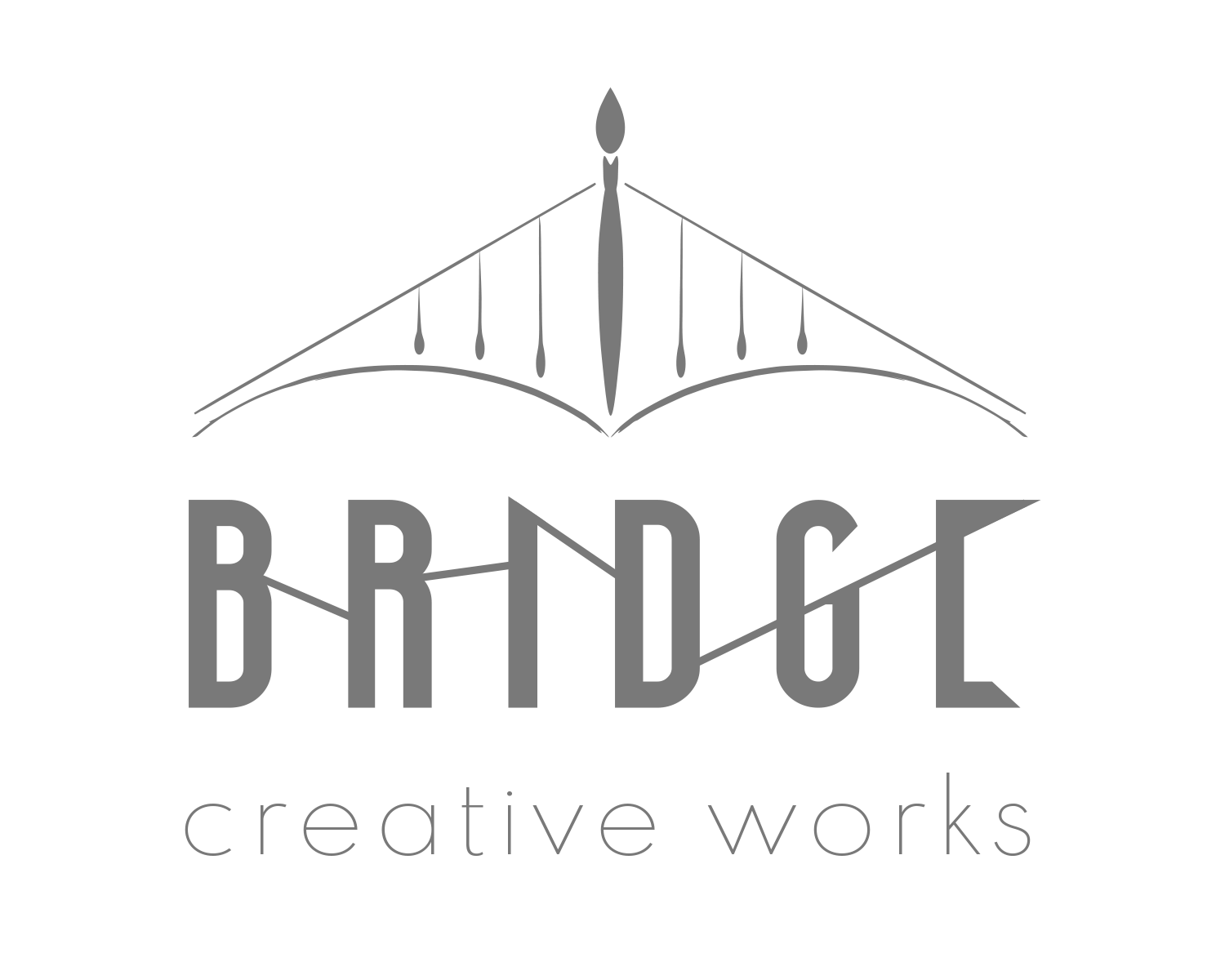
BRIDGE CREATIVE WORKS
BRIDGE is a creative studio and joint venture between a husband-and-wife artist team. Integrating their love for the arts and their experience in the visual and performing arts industries, the two have paired together to create one-of-a-kind musical instruments that serve as objects d'art. The "BRIDGE" name serves to honor that pairing, bridging the gap between the visual and performing arts. The use of paintbrushes forming a bridge as well as the lines connecting the letters of the title speaks further to the theme of connectivity.

WILD IDEAS PRESS
The Client is a self-publishing author looking for a logo/brand for the publishing arm of her business. The name of the Client's business, "Wild Ideas Press" brought to the Client's mind a light bulb, so this imagery was created in a warm yellow and coupled with a "typewriter" style font as a nod to the nature of Wild Ideas Press.

ELYRA
Elrya is a mineral-based organic wellness and skincare company. The beetle represents transformation and change, which correlates with the transformative properties of Elyra products and a clean lifestyle. The original artwork, a full color digitally painted representation, was simplified into linework that also reflects the values of the brand and is easily applied to brand packaging and other marketing materials.
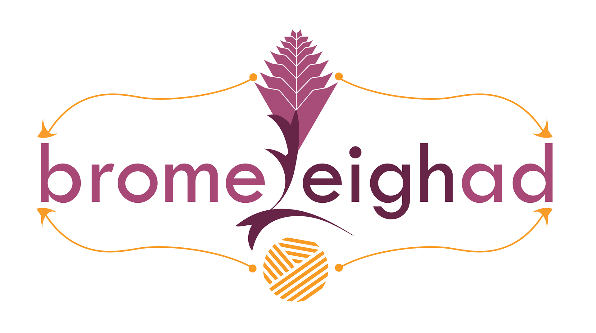
BROMELEIGHAD
Artist Leigh Martin was in search of a brand for her fiber arts business, which utilized organic elements such as mushrooms, leaves, and flowers painstakingly knitted and tremendous detail to resemble their living counterparts. Her chosen name "Bromeleighad" was selected as an homage to one of her favorite subjects, the bromeliad flower, and her own name. The Client's wish was to weave together the flower and medium she loved, each appearing to 'feed' the other. The "L" in Bromeleighad serves as a tether for the two.
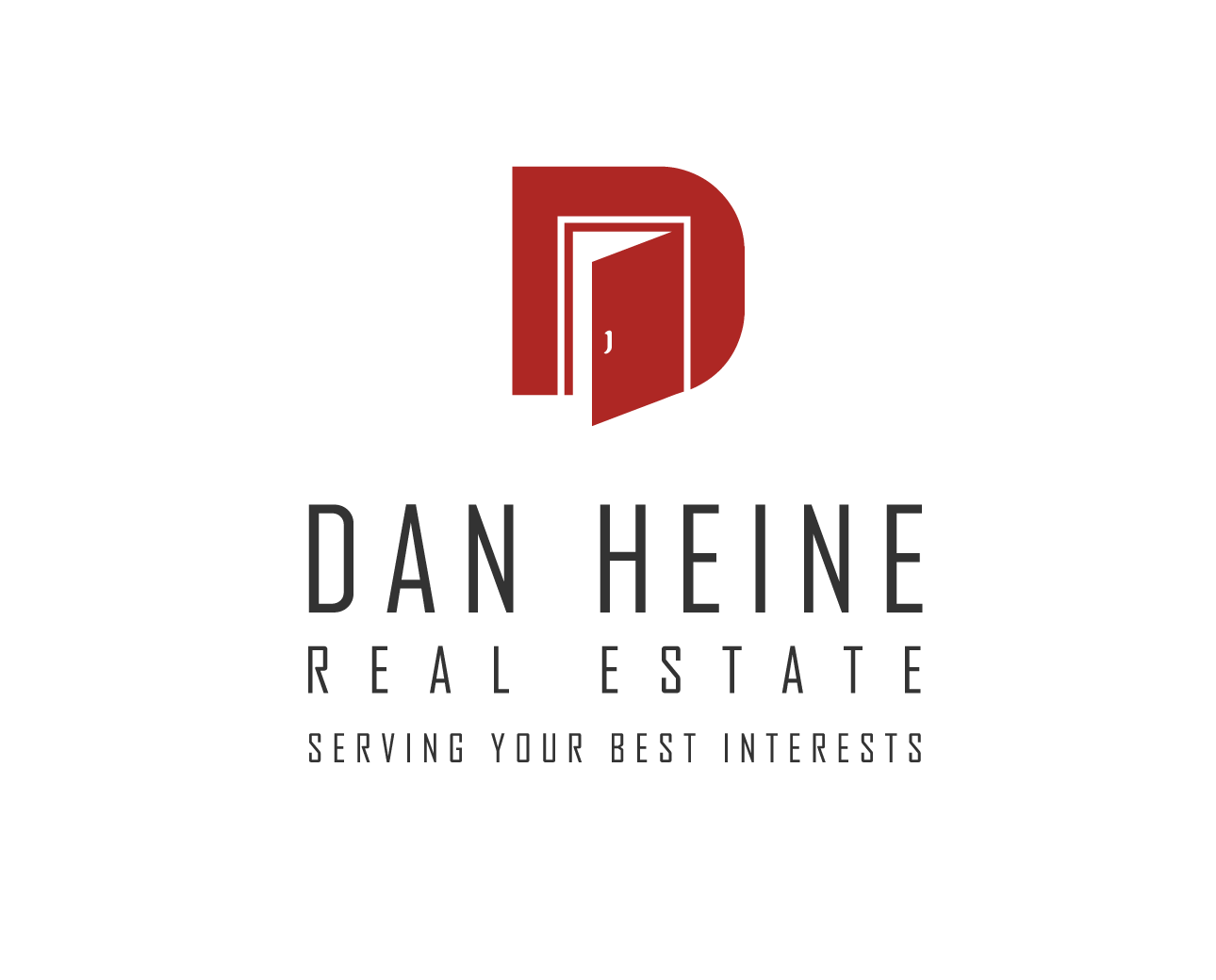
DAN HEINE REAL ESTATE
The Client has an existing logo for an established and successful real estate business. The Client did not wish to deviate tremendously from the existing logo, which consisted of an open door in his trademark red hue. The logo was given a slightly modernized makeover that honored the overall look and feel of the existing brand. Client's branding materials and social media posts often feature a white, black, or dark gray background, on which the new logo reads equally well. The clean and simple lines mean that the logo lends well to print and web media as well as signage.

GET IN TOUCH!
Thank you for contacting OA Graphic Design! I will be in touch soon to continue the conversation. You may also email ak@akorganicabstracts.com